UI & ACCESSIBILITY
Benefits App Rebrand
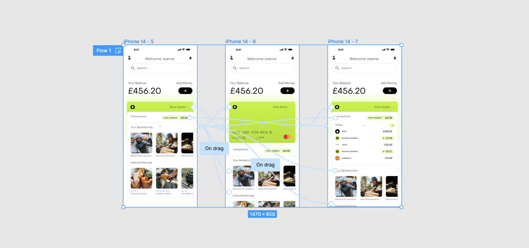
UX
User Journey
PROCESS
Wireframe & Ideation
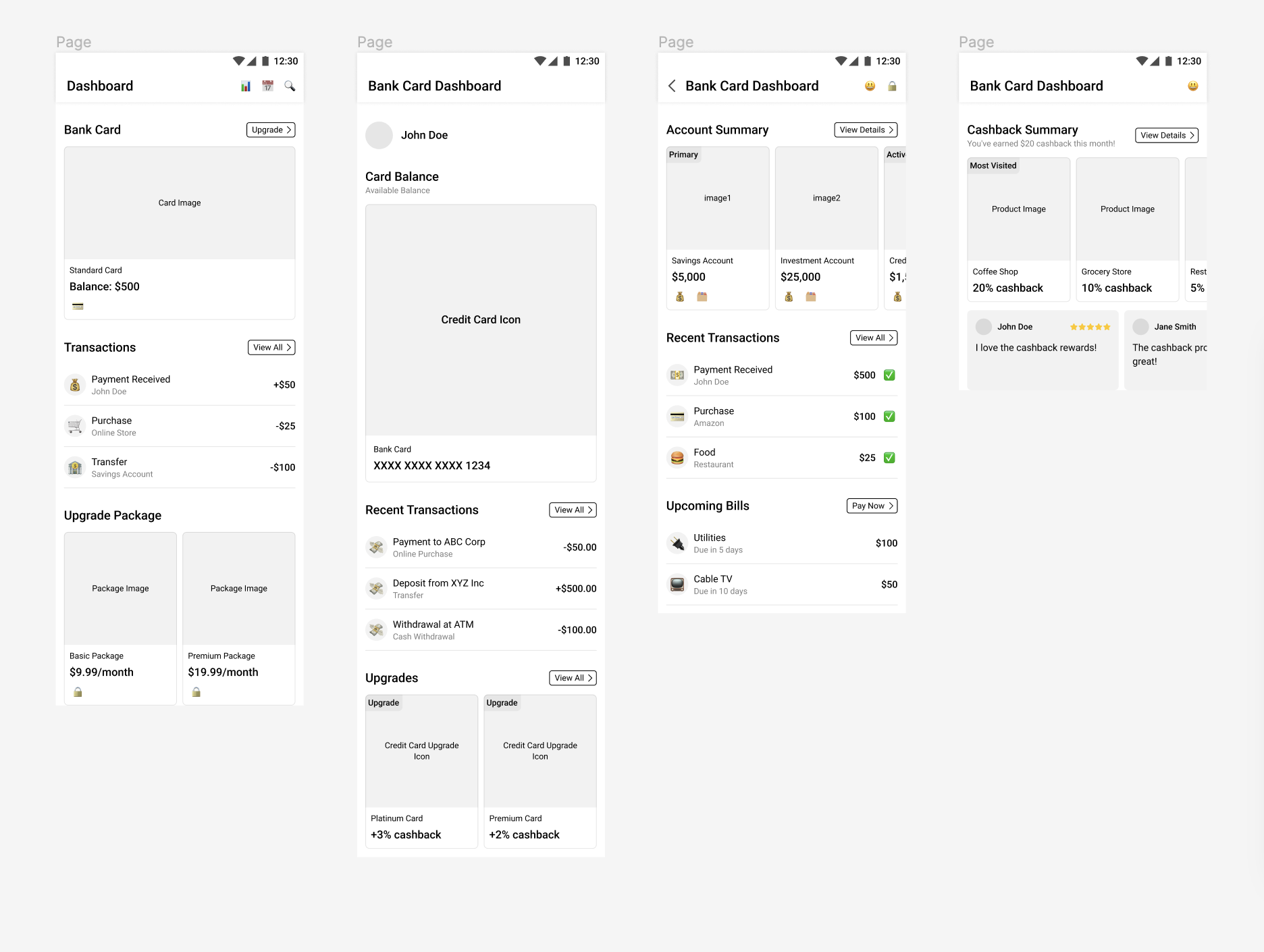
In order to quickly generate wireframes and concepts for this project I used a plugin powered by AI to generate some initial wireframe layouts and concepts. I ran prompts or varying specificity, some where I wanted the design to focus on the card and balance, some where I wanted the design to focus on highlighting cashback opportunities, and some where I wanted the design to focus on upgrades.
Ultimately I felt designs 1 and 2 were the most user friendly and recognisable designs. I did however like the social element of reviews on screen 4, and may look to incoropate that element into designs in future versions.
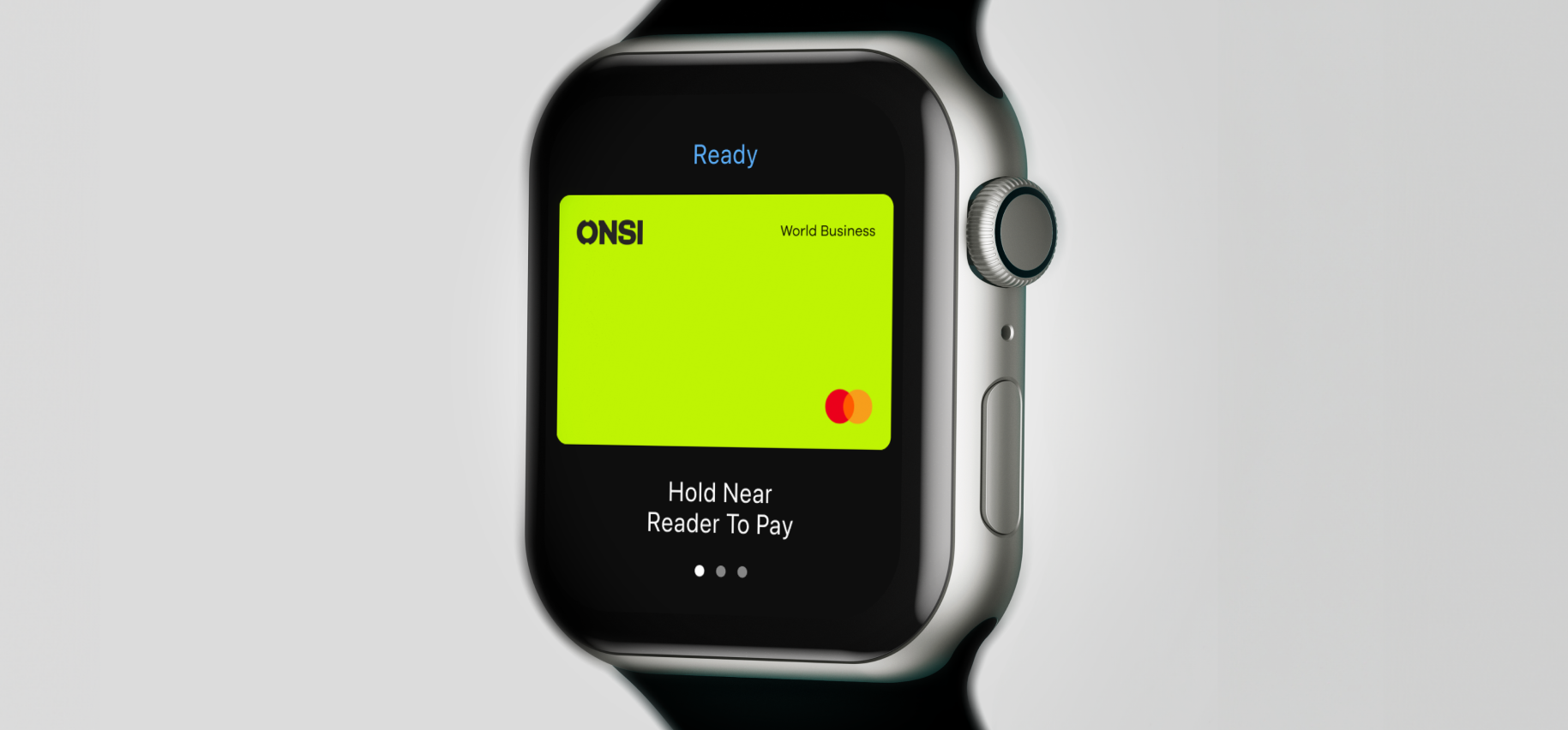
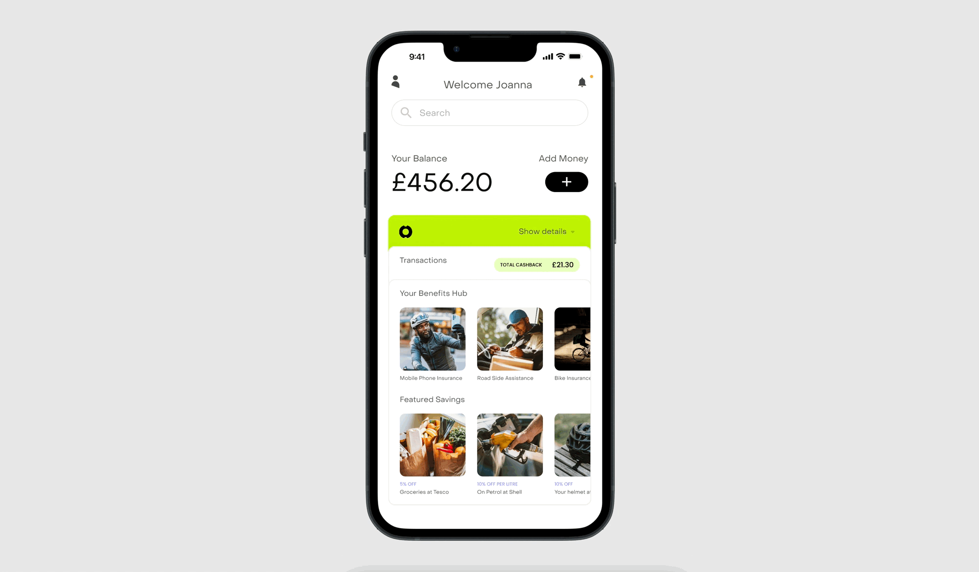
UI
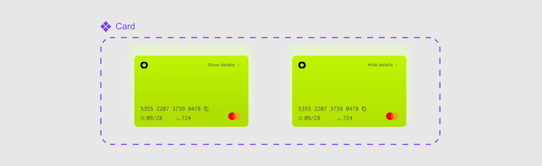
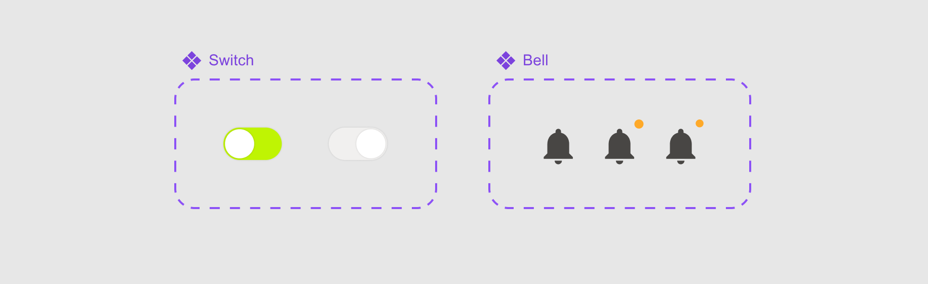
Components & Icons
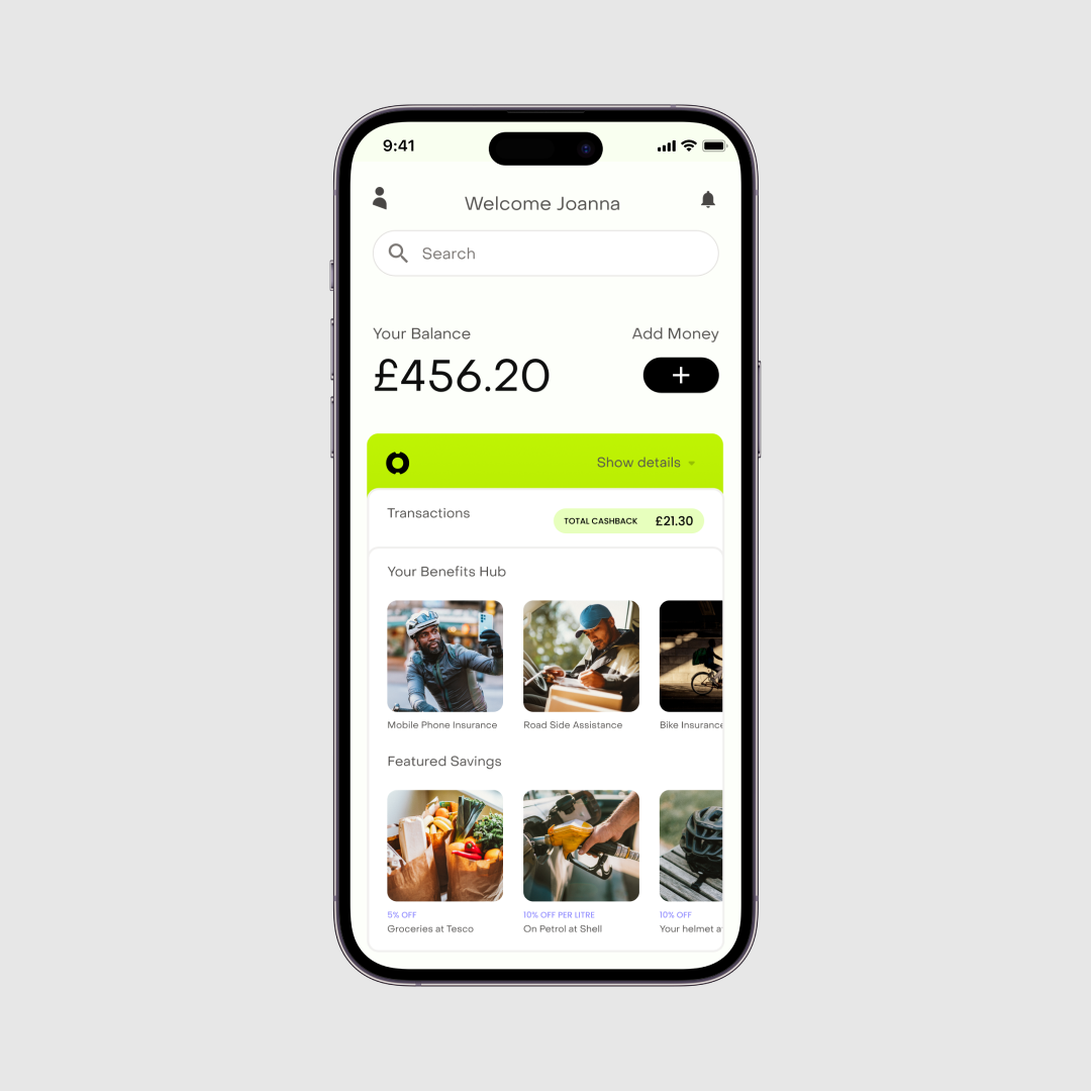
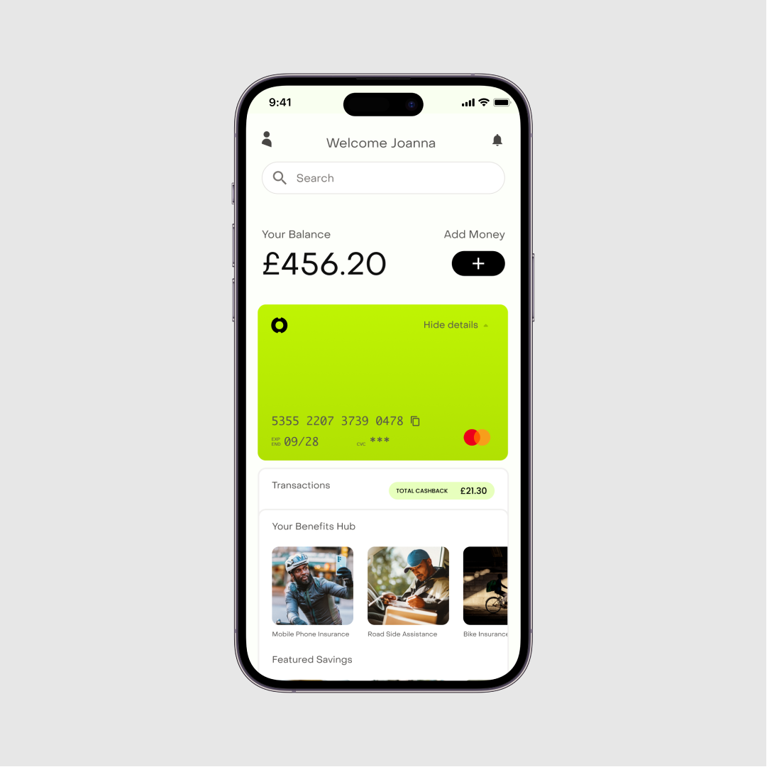
In addressing the challenge of 'dashboard information overload,' our approach to component design centered on delivering essential information at a glance. Each component was meticulously crafted to present users with the minimum and most vital topline data, allowing for further expansion if users sought more details. This design philosophy aimed to streamline user interactions and simplify the user experience.
UI
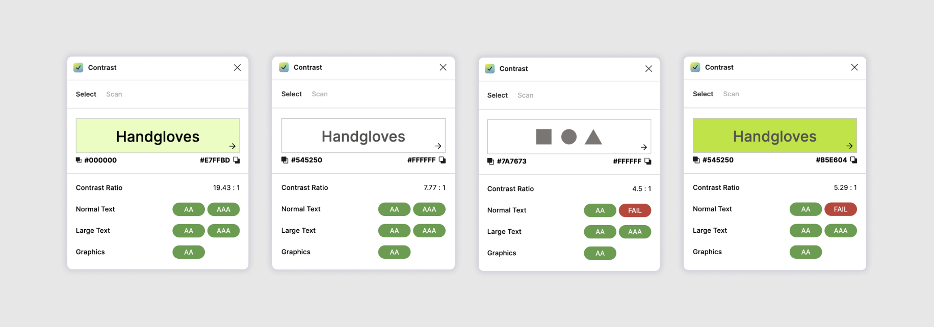
Accessibility
As a commitment to creating an inclusive user experience, accessibility standards played a role in this project. To achieve this, I set a baseline of at least the minimum AA accessibility standard, as it is essential to cater to users with various accessibility needs. Ideally for accessibility I would be seeking a AAA standard.